Hult EF
The fusion of EF’s two elite educational offerings under one banner: Hult EF / Corporate Education, calls for a new website to house all the education and training offerings.
UX Design, User Testing
As part of Education First’s Global Creative Team, we get the opportunity to act as an in-house agency to our many different EF products. One of these products, Hult EF, approached us to create a brand identity and a new website that caters for the B2B world as they sell executive education and language training.
The team for designing the website included me as the UX Designer, Russell Smith as the UI Designer, and Stefan Hellberg as project manager.
Merging two corporate institutions
The Hult EF website represents the coming together of two separate EF entities: EF Corporate, which offered language training to large organisations, and Hult Ashridge which offered executive education programs.
In December 2020, I joined the project to conduct the first round of user testing. That early user test proved to be very insightful and acted as a catalyst for the Hult EF team to reevaluate their course offerings. Throughout the entire project, prototyping and sketching proved helpful to start the right conversations between the stakeholders.
Remote user test conducted via Zoom on an Invision prototype.
Insights from the first user test
-
1.
The website seemed too split between language and leadership training that putting them together seemed unnatural.
-
2.
The content and structure of the website also favoured leadership training over language.
-
3.
There is a clear need for more detailed and relevant information about Open Programs.
-
4.
The terminology was not always clear and users didn’t understand what was meant by certain terms.
Creating a site map complex corporate website
The user test showed that the offerings and the information architecture need to be more considered.
Hult EF took some time after the test to reevaluate how they want to present its corporate solutions. In the end, they approached us with six key program offerings, which would be highlighted on the website, as well as other supporting pages that explain the methodology, the history of the company, and the insights hub which acts as a blog.
The site map with all the different pages and templates.
Defining a new navigational pattern
The way the information architecture is set up is that we have main courses and topics, and then more information and content pages within each of those ‘worlds’. The goal was to make it easy for users to navigate between the pages once they entered a particular offering, to ensure they could easily access the relevant information.
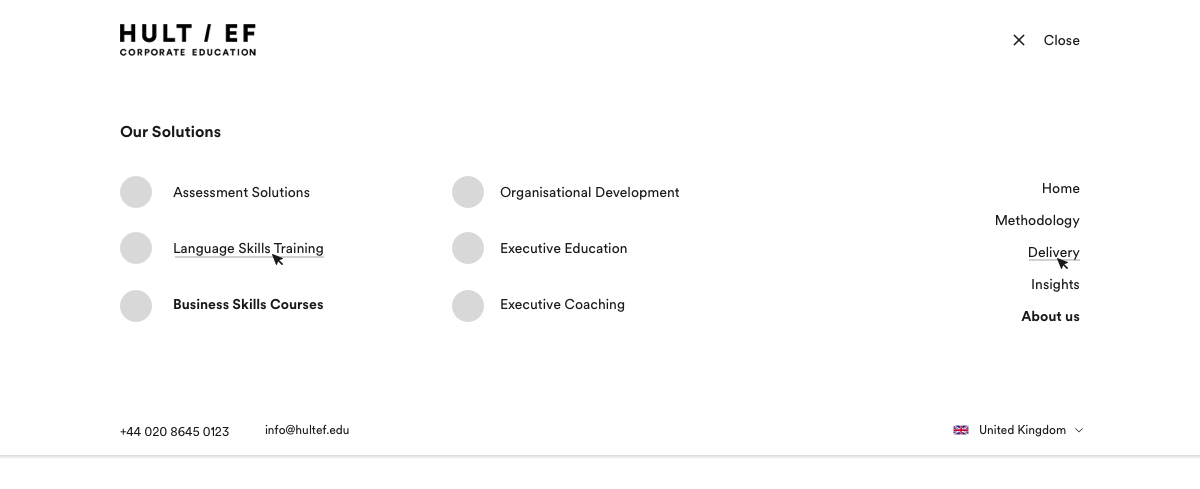
We created a global header that is accessible across all pages of the website and coupled it with a secondary navigation bar that becomes accessible once the user is one level deeper on the website in a particular program or the insights hub, for example.
The new navigatioinal pattern
Design for the global navigation accessible across the website.
Global navigation expanded.
Secondary navigation once users get a level deeper into the website.
Designing for a ‘future-proof’ website: components over pages
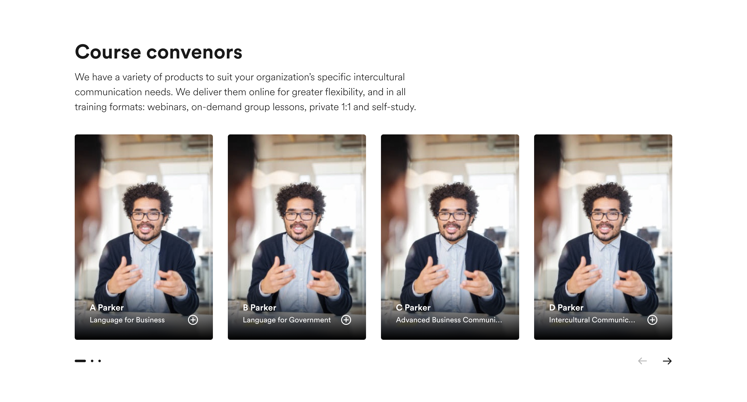
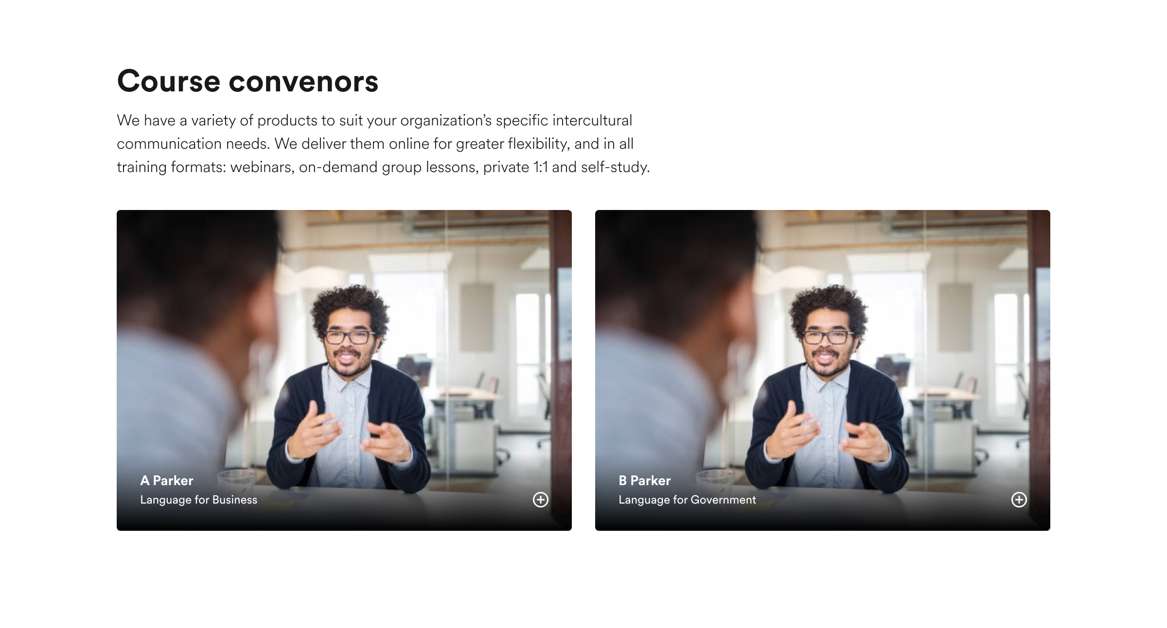
Instead of designing full pages, we focussed on designing a component library that would form the building blocks of the pages.
This saved a lot of time since the content of the website was still in development after we began designing. The challenge was that components should be flexible enough to be able to operate in different parts of the website, but they should also communicate hierarchy.
Creating tech specs and working closely with the development team
Russell and I create detailed tech specs to explain the design and behaviour of the different components. We also included edge case scenarios to accommodate the content.
This was an interesting exercise, as I learnt about ‘stress-testing’ designs and components, and understanding how they can behave and adjust in certain scenarios.
Our close working relationship with the development team coupled with regular meetings meant that the designs translated very well into the real world. The success of this whole project relied on our ability to collaborate, communicate and prioritise.
A snapshot of our tech spec space in Figma.
Analytics and user testing
The Hult EF website went live in October 2021. To ensure that we were providing a good experience for our users, we looked at the analytics of the site and ran user tests.
The client installed HotJar and Google Analytics so we might observe how users were navigating the site and would flag any issues that affected the user’s journey.
We scheduled a user testing session once the website is live. This way, we could see if any anomalies were raised in the analytics that we needed to investigate.
Even though Hult EF is predominantly B2B focussed, there is a B2C offering. Our goal was to explore how users navigate and become a lead within this particular flow.
Remote user test conducted via Lookback.
Areas of opportunity moving forward
-
1.
Differentiate better between B2B and B2C programs to help users clearly understand and navigate between programs for themselves or their organisation.
-
2.
Present users with more information on program delivery earlier on in the journey.
-
3.
Increase the visibility of the relationship of ‘Development Areas’ and the Open Programs.
-
4.
Ensure that all our users clearly understand the terminology we use on the site.
Next steps
I very much look forward to exploring the areas of opportunity to strengthen the B2C user journey within the Hult EF website. It all starts in the new year!
Visit Hult EF
See the full brand, UX and UI case studies on Behance and our company website, ef.design. Also, visit the Teach Online website.


